Beendhi, a French gourmet company that specializes in organic, vegan, ready-to-cook cuisine that is healthy, tasteful and convenient for working women and men in European cities. The focus is on a contemporary palette and on creating a sense of exploration and joy while making food which can be combined in new and interesting ways with other cuisines.
Founded by Beena Paradin, whose family hails from Kerala, Beendhi is creating waves in Europe, with plans to expand to other countries in the future. Beena is passionate about creating healthy, tasty and organic mixes to share her passion for Indian cuisine.
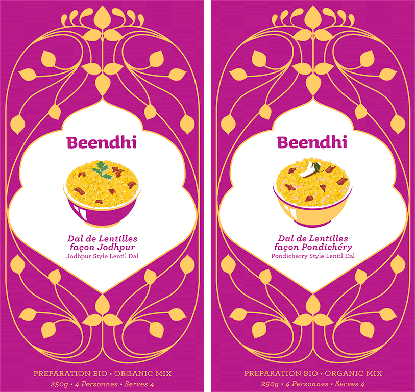
Beendhi Inde:
For the design of the India inspired cuisine, we took inspiration from the aesthetics of France and India — from Art Nouveau which is quintessentially Paris and traditional Mughal motifs. Both Art Nouveau and Mughal are inspired by nature and its organic form — but in different ways, as such they represent the idea of natural organic food in a perfect way.
While Art Nouveau is more free flowing, "Mughal" designs tend to be more structured and geometric. We chose colors that reflect both the European and Indian market by pairing vibrant colors with pastels. All illustrations were also produced by our team.
How we stack up!
We recently made a trip to Paris and London, and visited several organic boutique and high-end and mainly organic grocery stores in Paris such as: BioCoop Dada Paradis Welcome Bio, Maison Plisson and Le Grande Epicerie de Paris . In London we visited Planet Organic, Wholefoods, Waitrose and Daylesford
The challenge also is that each store stacks the products in different ways and sometimes in different categories. For instance, Le Grande Epicerie stacks products by country, so Beendhi comes in Inde (India), where it really nicely stands out despite the bright colors used by the competition. At the design stage not only did we suggest the graphics and concept as is expected of any designer, but we also studied the French and European ways of shelving and came up with the suggestion of using a simple straight box that shows the product in the best possible manner as it gets the most light and surface area. Added to that the use of color and the name of the product against a white background and you have one of the best stand-out products on the shelf.